Kosy K9s & Katz
- kosyk9s.co.nz
- Website refresh
- Relaunched June, 2023
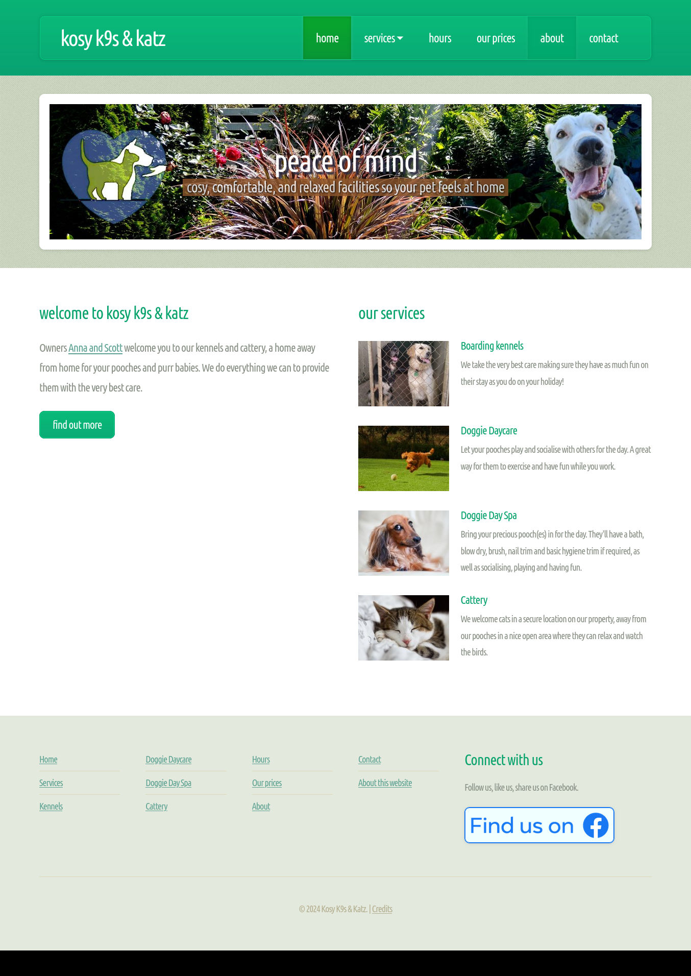
The current owners of Kosy K9s inherited a website they didn't like or understand, and which didn't suit them. They wanted something brighter, in blue/green with their new logo, which shows how the place is. Pet owners want to know what a place is like.
My personal experience using kennels supports that too. We pet lovers do our research. We find places online, we favour websites that answer our questions and address our concerns, and we sometimes make enquiries.
I successfully suggested we adapt a theme that I'd adapted in turn from a designer online. I modified Minimaxing for Kosy K9s use, including the new logo. I also needed to extend the theme to, for instance, show the photo galleries that featured on Kosy K9s' new site.
With lots of clients available via online search, we needed good quality, descriptive, helpful text content. I coordinated the content and generated much of it from an onsite visit where I interviewed the kennel owner/manager. We also needed interesting media (photos), which I was able to grab when touring the kennels, with the purpose of showing how the place is. I also sourced some images online and even used some of my own (like this 404 page featuring a special guy I miss).
We publish open times clearly on the site. We also have the phone number and a link to map directions for customers using mobile devices, possibly heading to the kennel site.
The contact form I built is simple, proven, and fast. It took some time to find a way to block spammers without annoying or imposing on users. Correspondents receive a near-instant acknowledgement of their message.
The website may be expanded in future to include:
- online booking
- social media feeds of media for pet updates
- chat connect via social media bridge or chat widget.